Did you know 94% of shoppers form their first impression of your business in less than 50 milliseconds? This rapid assessment is akin to the speed of a lightning flash. As mobile commerce is set to capture 62% of online sales by 2027, the layout of your website transcends mere aesthetics. It serves as the cornerstone of driving conversions, fostering loyalty, and increasing revenue.
At Macro Webber, we excel in “Performance Marketing That Drives Revenue®”, integrating advanced design with data-driven methodologies. The case of luxury brand Badgley Mischka exemplifies this synergy: their refined, user-friendly interface resulted in a 37% reduction in bounce rates and a doubling of average order values. This achievement is rooted in scientific principles, not magic. Each element, from button placement to color scheme and loading speed, significantly influences whether a customer is drawn further into your sales funnel or steered towards competitors.
Your online store transcends its role as a digital catalog. It functions as a perpetual salesperson, brand ambassador, and customer service center. The necessity of a mobile-first approach is no longer debatable—61% of users will abandon a site that proves difficult to navigate on their mobile devices. Yet, when design harmonizes with user intent, such as through the implementation of layered filters for specific product searches or streamlined one-click checkout processes, you can transform casual browsers into devoted customers.
Key Takeaways
- First impressions are 94% design-driven—optimize visuals and loading speed immediately
- Mobile commerce will dominate 62% of sales by 2027: prioritize responsive layouts
- Align design with brand identity (e.g., Badgley Mischka’s luxury-focused UX)
- Every design element should guide users toward conversions, not just aesthetics
- Partner with experts like Macro Webber to blend creativity with performance analytics
Understand Your Target Audience
The foundation of a thriving online store lies in a profound comprehension of its clientele and their unmet needs. A user-friendly e-commerce site transcends mere visual appeal; it embodies a meticulous alignment of every design element with the preferences of its audience. AS Colour exemplifies this principle, with its minimalist aesthetic and neutral color scheme mirroring the consumer’s penchant for simplicity and efficiency. This exemplifies the imperative that design choices must serve real user behavior.

Create User Personas
The genesis of a successful e-commerce venture lies in the creation of detailed user personas. These fictional entities should encapsulate:
- Demographics (age, location, income)
- Shopping habits (device preference, frequency)
- Pain points (slow checkout, unclear product filters)
Utilizing platforms such as Macro Webber, which offers templates for persona development, integrating purchase history data, enables a precise visualization of the ideal customer. This facilitates the crafting of a responsive e-commerce design that dynamically accommodates their requirements.
Analyze Customer Behavior
Employ heatmaps and session recordings to monitor visitor interactions with your site. Identify recurring patterns:
“70% of retailers now prioritize AI-driven personalization to predict customer preferences.”
Pay attention to areas where users abandon carts or prolong their stay on product pages. Macro Webber’s behavior analytics dashboard can automate this process, highlighting areas where your design may perplex mobile or desktop users.
Gather Feedback and Iterate
Customer feedback is invaluable. Utilize these strategies to refine your design:
| Feedback Method | Implementation Difficulty | Impact Level |
|---|---|---|
| Post-purchase surveys | Low | High |
| Heatmap analysis | Medium | Medium |
| A/B testing layouts | High | High |
Introduce changes incrementally. For instance, if customers express a desire for quicker navigation, consider testing a streamlined menu structure before undertaking a full redesign of your header. This iterative methodology ensures that your site evolves in tandem with your audience’s evolving expectations.
Prioritize User Experience (UX) Design
The success of your e-commerce site is directly correlated with the ease of interaction for its visitors. Macro Webber’s approach, encapsulated in “Performance Marketing That Drives Revenue®”, is quintessential here. It posits that a seamless UX design is a catalyst for conversions. A site that is well-organized not only keeps users engaged but also reduces bounce rates and fosters trust. Let us dissect three critical components to enhance your digital storefront.

Simplify Navigation
Menus that are convoluted can repel customers with a swiftness that rivals a slow checkout process. BB Wheels exemplifies this, witnessing a 32% reduction in cart abandonment post-introduction of their Vehicle Visualizer tool. This innovation enables users to filter tires by car model, year, and size in mere three clicks. Adopt these strategies:
- Utilize mega menus for categories with 10+ items
- Implement predictive search with autocomplete
- Ensure the checkout process is condensed into under 5 steps
Optimize Page Load Speed
Combat Corner’s page view increase by 49% is a testament to the importance of swift loading times. Each second of delay can result in a 7% loss of sales. Top agencies recommend the following fixes:
“Employ WebP format for image compression without sacrificing quality, complemented by lazy loading for product galleries.”
Integrate content delivery networks (CDNs) with server-side caching. Utilize tools like GTmetrix to identify and rectify bottlenecks in real-time.
Ensure Mobile Responsiveness
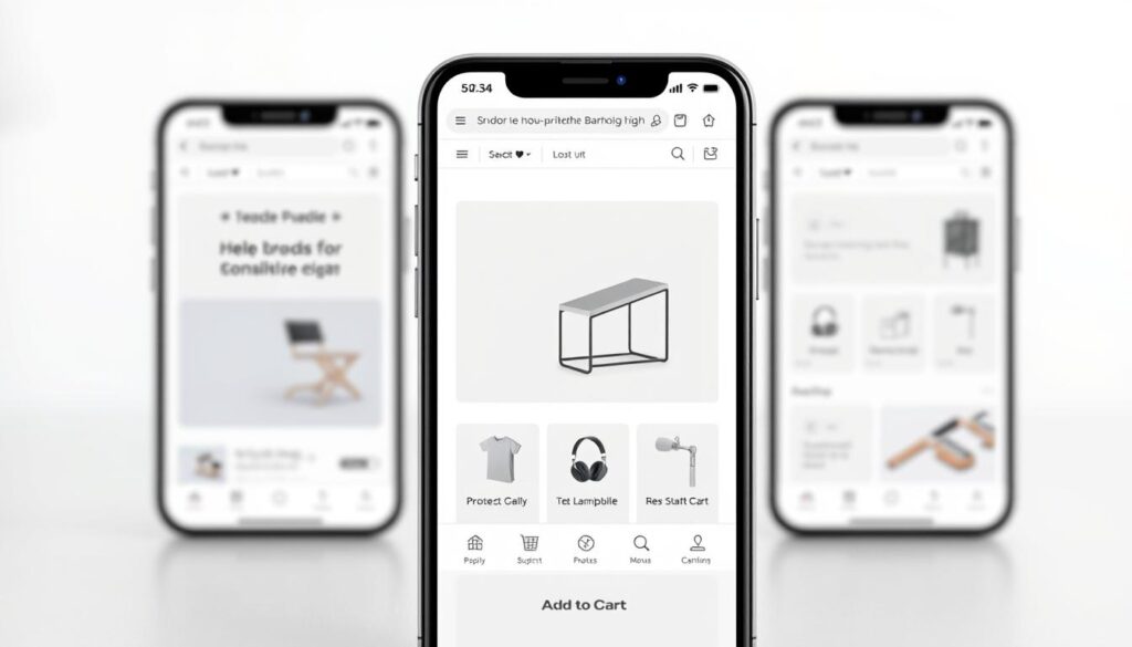
With over 67% of U.S. e-commerce traffic originating from smartphones, a mobile-friendly e-commerce design is no longer a nicety—it is a necessity. Test these elements:
| Feature | Desktop Version | Mobile Version |
|---|---|---|
| Button Size | 40×40 pixels | 60×60 pixels |
| Font Size | 16px body text | 18px body text |
| Image Layout | 3-column grid | Full-width carousel |
Employ Google’s Mobile-Friendly Test to identify issues. It is noteworthy that mobile-first layouts often surpass responsive designs in terms of conversion rates in web projects.
Optimize Visual Elements and Branding
Your e-commerce site’s visual identity serves as its distinctive hallmark, instantly recognizable and impossible to overlook. Strategic design decisions in imagery, colors, and messaging can elevate conversions by 80% while fortifying brand recall. Let’s dissect how industry leaders transform pixels into profits.

Use High-Quality Images
Low-resolution product images can deter sales. LARQ witnessed a 37% increase in conversions by employing sharp lifestyle photography that showcases their water bottles in dynamic settings. Adhere to these image best practices:
- Photograph products from multiple angles with zoom functionality
- Depict items in real-world contexts, akin to Moore Brothers Wine’s vineyard photographs
- Optimize file sizes to under 100KB without compromising quality using WebP format
Pro Tip: Accompany images with SEO-optimized alt text, such as “stainless steel water bottle with UV purification”, instead of generic descriptions.
Consistent Color Schemes and Fonts
Color consistency significantly enhances brand recognition by 300%, as underscored by MIT research. MitoQ employs soothing blue gradients to reflect their antioxidant supplements’ scientifically-backed benefits. Adhere to these guidelines:
- Select 1 primary and 2 accent colors maximum
- Opt for fonts that resonate with your brand’s personality (serious = sans-serif, playful = rounded)
- Ensure identical hex codes across all platforms
“Our burgundy-and-gold palette isn’t just aesthetically pleasing – it directly references Napa Valley sunsets to resonate with wine aficionados.”
Emphasize Your Brand Message
Every visual element should loudly proclaim your unique value proposition. Observe how LARQ’s product pages emphasize “pure water anywhere” through mountain-backdrop hero images and hydration-tracking infographics. To amplify your message:
- Position your slogan in the header and footer
- Employ icons that symbolize core benefits
- Integrate branded patterns in packaging shots
Seeking assistance in aligning visuals with SEO? The team at Macro Webber excels in conversion-focused design that also excels in search rankings.
Implement Conversion Rate Optimization (CRO) Strategies
A responsive e-commerce design necessitates the integration of conversion-focused strategies. Each interaction, from clicks to scrolls, should be meticulously designed to steer users toward making a purchase. Brands such as Burrow employ interactive CTAs that dynamically adjust based on user behavior. Concurrently, BigCommerce incorporates A/B testing tools, enabling the refinement of layouts in real-time.
Strategically Place Call-to-Actions (CTAs)
Position CTAs in locations that capture attention without disrupting the user’s shopping flow. Optimal placement includes near product descriptions and the use of sticky checkout bars for immediate access. Data from First Source indicates that 13% of shoppers abandon carts due to insufficient payment options. Consider integrating BNPL choices, such as Afterpay, during checkout to enhance user experience.
Use A/B Testing for Improvement
Engage in testing various elements, including headlines, images, and button colors, to identify what resonates most with your audience. BigCommerce’s built-in A/B testing tools facilitate the comparison of different layouts side-by-side. Dippin’ Dots exemplifies the impact of small changes, increasing conversions by introducing a calendar tool for event orders.
Include Trust Signals and Reviews
Display SSL badges, money-back guarantees, and customer reviews proximal to CTAs. Platforms like Macro Webber streamline the incorporation of trust elements into your conversion-focused web design. Authentic testimonials from verified buyers can significantly elevate purchase confidence, potentially by up to 63%.
Optimizing checkout processes with flexible payment options and clear trust signals can substantially reduce friction. Tools from Macro Webber facilitate the automation of these processes, ensuring your responsive e-commerce design effectively converts casual browsers into dedicated customers.


